Showing posts with label Design. Show all posts

Friday, March 8, 2019

Cover Love {Indie Edition}


Sometimes self-published authors get a bad rap because of a few that don't care about how their book looks, as long as it's published. But then you have those that show that they really do put time, effort, and expenses into their works. So I'll be featuring a few of these lovely covers here today! I wasn't asked to advertise, and I don't necessarily recommend them, as I haven't read them all—I'm simply admiring their book covers.

Martin Hospitality—Abigayle Claire


Watercolor covers are hugely popular right now, with this one being no different! The fonts complement the picture so well. (Yes, you'll probably hear me talk about fonts a lot. Because, I mean, fonts are epic and I love them.)

 Seek—Angela Watts


When thinking of a way to describe this cover, the first phrase that came to mind was "kick-butt." Seriously, that's what every single element in this cover screams. And I'm kind of a fan of those boots.

Quest for Leviathan—Amanda Tero


Okay, I'm gonna talk about the fonts again. Sure, I love the picture, and the water is perfect, but those fonts! I love the color that really pops out, as well as the shadow that really adds dimension that you don't really even realize is there until you look for it.

Gift from the Storm—Rebekah Morris


Okay, yeah, another font instance. But those colors are spot-on. the pinkish tint on the gray background is amazing and ties everything together with perfection.

Live Without You—Sarah Grace Grzy


Yeah, this is one of those covers that makes you say, "awww!" I don't know what it is about the night sky, but I love the colors all blended in. And the white lettering stands out in such an epic way.

The Old River Road—Ivy Rose


This cover really looks pretty simple until you take a gander at that title and the design surrounding it. Wow. It really looks like something you'd see on a banner during the 1800s, which would be when the book is set.

Widow's Heart—Willowy Whisper


Yep, the colors. The colors are everything in this cover. The pictures seriously blend together in a way that just makes you sigh in contentment. I mean, the fonts too, of course. The fonts, the photos, everything . . . this is a talented designer.

Beyond Her Calling—Kellyn Roth


Yes, just so much yes about this cover! Once again, all the photos blend together so smoothly, complementing each other in an irresistible cover. Plus, I'm a huge fan of music, so of course that kinda clinches the deal.


 Have you read any of these? Are they as good on the inside as they are on the outside? Which was your favorite?


Friday, January 11, 2019

5 Royalty-Free Photo Sites

As a graphic designer with a budget, I'm constantly on the lookout for free photos. Sometimes I'll use my own photos, but my subjects are limited, as are my photography skills. So for me, royalty-free photo websites are a life-saver. If you're a fellow designer, you understand the struggle of finding the perfect photo for your project! For me, the biggest issue is finding a royalty-free photo without any strings attached. I prefer to find pictures without any attribution requirements, and finding one without requirements that fits my purposes makes things even more complicated. But I've compiled a list of royalty-free photo sites for your (and my) benefit.


Each photo is from the featured site, font added by yours truly.

StockSnap.io

Pexels

Pixabay

Unsplash

Flickr


I hope I've now broadened your horizons when it comes to finding free photos!
What's your favorite site?

Wednesday, December 19, 2018

Christmas Cover Love {12 Days of Christmas}

Welcome to day 2 of the 12 Days of Christmas blog party!  Today I'll be sharing some beautiful Christmas book covers.


Note: I do not necessarily recommend any of these books.  I'm simply sharing the covers because of... well... their beauty.  You can't go wrong admiring a gorgeous cover, now, can you?

An Endless Christmas—Cynthia Ruchti


With this book, I love the title font.  It adds such a whimsical element to the cover.


The Old Mansion's Secret—Rebekah Morris


At first glance, I thought the ornament in the cover is suspended amid a flurry of snow, but upon closer look, it's hanging in a tree.  That fact, along with the mansion pictured, sums up the entire story perfectly, as a cover should.


Beyond the Horizon—Jesseca Wheaton


I'm not usually a fan of faces on the front of books, but this instance, added to the three-dimensional appearance of the title, makes the cover perfect.


Red Boots—Kate Willis


The boots, the dress, the fonts, the colors all blend together to create a picture-perfect (literally) cover that (obviously) exactly matches the title.  But what really draws everything together, what really makes this cover appealing to my eyes, is the gray background, with the snowflakes seemingly embedded into the sidewalk.


Bespoke—Amanda Dykes


First of all, I'd just like to admire this designer's incredible ability to make a book cover look like a movie cover.  The window hints at things yet to be told, or maybe simply the joy of opening a window to find new things untold.  And. Those. Fonts.  They're just perfection.


One Enchanted Eve—Melissa Tagg


'Enchanted' is certainly the word I would use to describe this cover!  The overhanging clouds, the snow, the trees, the bridge beckoning readers to cross it into the pages inside this book.


Join us tomorrow for another author interview!
Also, don't forget to visit Faith's blog for the list of other participators, as well as the giveaway.

Click on the image to be redirected to Faith's blog

Friday, November 2, 2018

Book Cover Challenge—Part 2

Time for part 2 of our cover challenge!  Thanks again to everyone who participated!

On a side note, I'd like to once more say that these covers will not be used for anything or any books.  However, if you would like to purchase one for our cover price, send us an email and we can work something out!


My Goodbye Summer


Once again, our first cover today is by Jesseca!  I just love the golden sunlight with the silhouette reflecting on the water.  Reminds me so much of summer.  Plus, the accents at the bottom add perfect texture.


Mercy Opens my Eyes


As I made this cover, my brother looked over my shoulder and said, "that doesn't look like eyes."  I think he missed the point.  This was probably one of the hardest covers to create, because the title didn't even give me a plot line to go with.  So after much searching, I found this picture and fell in love with it.  (Yes, it's totally possible for a graphic designer to fall in love with a picture.)


The Mystery of the China Doll


One of the biggest blessings, yet biggest curses, of a graphic designer, is that sometimes we know exactly what we want the cover to look like, and therefore, exactly what picture we want.  Well, in this case, I knew what I wanted—the blessing.  The curse?  Not being able to find the picture I wanted anywhere!  So I had to resort to taking my own picture.  I was actually quite impressed with my photoshop skills.


The October Horse


I actually had the photo for this one stored away in my stash, knowing it was one that I would definitely use someday.  And I couldn't be more thrilled with the way the colors worked with the title!  And we can't forget to admire the fonts, of course.


Sunflower Smiles


As is probably obvious by the design of the website, I love sunflowers.  So when Jesseca told me she would do this one, I was super excited to see what she'd come up with.  I wasn't disappointed!  The colors and fonts came together so nicely, I couldn't help but smile!


Waiting for Percy


This one though... what I had in mind at first was a romantic spin.  But after I created a cover and wasn't happy with it at all, my mind wandered to other aspects.  And when I found this photo, I knew I couldn't pass it up.


When Will the Storm Come?


Ahhh, I just love this one so much!  This is another picture I had stashed away, and as soon as I saw the title, I knew that this was the one I wanted.  Plus, I experimented with a new-to-me photo editing site, and it turned out amazingly.  The fonts just... yes.  So much yes.


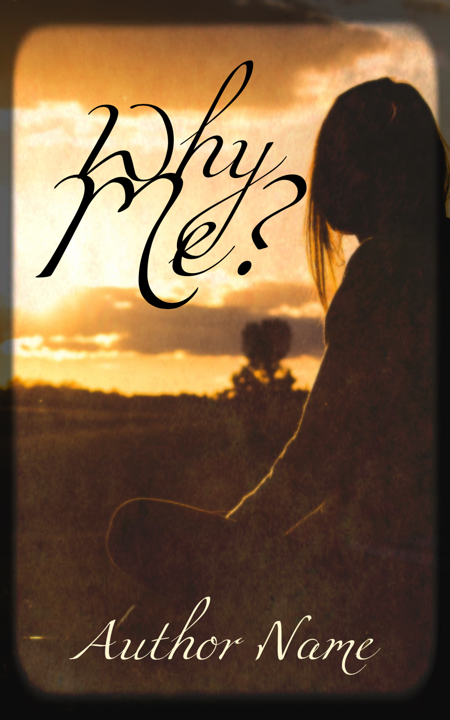
Why Me?


Last but not least is another of the hardest ones.  I tried something new with the border, and I think it turned out really well!  The colors of the sky, plus the light filtering through the strands of hair, add an aesthetic feel to the cover.


What do you think?  Did you like these as much as the ones from last week?  Which was your favorite?

Friday, October 26, 2018

Book Cover Challenge—Part 1

Well, we certainly got feedback for our cover challenge!  Sixteen covers to create, actually.  Thanks to all you imaginative minds, I was hard-put to match your creativity.  So, to demonstrate her own graphic design abilities, I invited Jesseca, our formatter, to join in on the challenge!

After looking over the lot of covers, I decided to organize them alphabetically and then split them up into two different posts.  Part two will be posted next week.


All for You


Our first cover was created by Jesseca!  She put a sweet interpretation on the title that I never would've thought of.  It makes me want to step right into the picture and hug the people.


Almost Home


Next is a title that I wasn't quite sure what to make of it, but I began looking for pictures, and once I found this photo I knew I wouldn't have to look any further.


The Boy no one Loved


When I created The Boy no one Loved, I couldn't pass up this picture.  The sweet, yet sad, innocence of the little boy drew me in, and I adore this one.


A Candle in the Darkness


Somehow, even thought there's no hint of it in the cover, this reminds me of Christmas.  Maybe it's the memories of candlelight services at church.  I must admit that this wasn't what was in my mind when I saw the title, but I think it's just as good—or better.


The Day the Soldiers Cried


This one low-key breaks my heart.  We can never thank the defenders of our country enough.  Because it's not only them, but those that love them as well, that make the sacrifice.


Follow Me


I was having a difficult time creating an idea in my head... but then it hit me—Jesus!  Many of His friends and disciples were fishermen.  He called them to follow Him, so that He might make them fishers of men.


Grab Your Umbrella


My favorite part of this cover is the fonts.  It adds a playful, almost childish, touch to the entire feel of the picture that matches the title.


I'm Part of the In-Crowd


Last but not least is a cover with a picture so epic that I hardly had to 'doctor' it at all.  A tiny bit of barely-perceptible texture goes a long way!  I also enjoyed experimenting with different fonts.


Did you enjoy seeing the results of the challenge as I enjoyed rising to the challenge?  Did I meet your tastes?  Which is your favorite?

Friday, October 19, 2018

Cover Love

Next week I'll post the results of the cover challenge, but in the meantime, let's enjoy some other creations, shall we?

Even though I sometimes slightly judge bad covers, I do have a healthy respect for well-made covers.  I know that I am far from perfect as a designer, and I hold in great esteem those who can create covers that make you pause and just say, "Wow."  Someday, I hope to be the creator of one.

So today I'll share a few of those covers.  If you love to squeal over—or simply admire—beautiful pieces of art like these, you've come to the right place!
NOTE: I have not read all of these, so I cannot recommend them as books, only covers.


The Accidental Guardian—Mary Connealy


The simplistic beauty of the cover really draws me in—it definitely looks like a book to pet!  The sweet relationship between the man and the little girl that it suggests is endearing, and the border along the top adds just the right touch.

Salt to the Sea—Ruta Septys


Being a novel set in the Word War II era, this cover naturally hints at the darkness of the times.  While complete lowercase letters tend to grate on my nerves, I believe that in this case it adds a perfecting measure.

A Distant Melody—Sarah Sundin


The font isn't overly dramatic, but the simplicity, added to the beautifully and perfectly shaded sky, not to mention the overall historical look, makes me, someone with an aversion to romance, want to read it for myself.

Gunner's Run—Rick Barry


What I appreciate about this cover is that the font is spot-on!  And I love the historical feel that the photos give.  Plus, the plane at the top gives credit to the title.

Fawkes—Nadine Brandes


Last but not least, one of my all-time favorites.  Once again, what I love most about this cover is the fonts.  They seriously tell so much about the book!  And the mask—intrigue and mystery, with the cracks in it hinting that those secrets are about to be revealed.


And there are five amazing covers all worthy of admiration.  Have you read them?  What are your favorite aspects?  What are some of your favorite book covers?

Follow Our Blog